1. html
<!-- BASE URL
Setting base URL - eliminates a LOT of
redundant markup. -->
<base href="https://assets.codepen.io/191814/">
<!-- BUTTON CONTAINER
FOR DEMO. Buttons will inherit
width of their parent container. -->
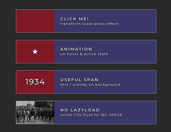
<div class="button-container">
<!-- BUTTON MARKUP -->
<button class="unique-button-class">
<div class="lazyload" data-bg="tommy-concouse-trumpet.jpg?width=300&height=216&format=auto">
<span></span>
</div>
<h2>Click Me!</h2>
<h3>transform scale press effect</h3>
</button>
<button class="unique-button-class spin">
<!-- SPIN Animation class applied to SPAN overlay -->
<div>
<span>★</span>
</div>
<h2>Animation</h2>
<h3>on hover & active state</h3>
</button>
<!-- BUTTON MARK-UP WITH SPAN TEXT OVERLAY
The SPAN container overlays the background
image DIV container. -->
<button class="unique-button-class">
<div class="lazyload" data-bg="1934-vesey-walker-evelyn-pennak.jpg?width=300&height=216&format=auto">
<span>1934</span>
</div>
<h2>Useful Span</h2>
<h3>text / overlay on background</h3>
</button>
<!-- BUTTON MARK0UP NO LAZYLOAD
Background image as inline style for keft panel background image
-->
<button class="unique-button-class">
<div style="background-image: url(berlin-1934-vesey.jpg?width=300&height=216&format=auto);"><span></span></div>
<h2>NO LAZYLOAD</h2>
<h3>Inline CSS Style for BG IMAGE</h3>
</button>
</div>
2. css
                /*  GOOGLE FONT
      All fonts vary.  Best to use fonts intended for production when styling things. */

      @import  url("https://fonts.googleapis.com/css2?family=Montserrat:ital,wght@0,500;0,600;1,400&display=swap");

/*  USEFUL . RESPONSIVE . CUSTOMIZABLE . BUTTONS
      Am tired of making buttons.  This one works for most of my button needs.

    Buttons have a left panel to display background images.  The SPAN tag is an overlay
    for the left panel.  Active state of button disables pointer events.
    Used transform scale to simulate a simple button press effect.

Veratile.  Play with sizing and styles.

*/

:root {
  /*  BUTTON PARENT CONTAINER --> For demo. */
  --button-container-max-width: 600px;

  /*  BUTTON MAX WIDTH - % of parent container width or fixed pixels
        Adjust other variable - i.e. width/height/font-size - so other shit fits. lol */
  --button-max-width: 100%;

  /*  BUTTON DEFAULT MIN-HEIGHT i.e."Mobile First" */
  --button-min-height: 65px;
  /*  BUTTON LARGE SCREEN MIN-HEIGHT Add additional breakpoints as needed. */
  --button-large-screen-min-height: 100px;
  /*  LEFT BUTTON PANEL DEFAULT WIDTH - i.e."Mobile First" */
  --button-div-width: 90px;
  /*  LEFT BUTTON PANEL LARGE SCREEN WIDTH */
  --button-div-large-screen-width: 163px;

  --button-text-font: Montserrat;
  --button-text-color: rgba(255, 255, 255, 1);
  /*  BUTTON BRIGHTNESS - Easier on the eyes */
  --button-brightness: 0.95;
  --button-border-color: rgba(255, 255, 255, 0.45);
  --button-border-width: 1px;
  --button-background-color: rgba(60, 59, 110, 1);
  --button-background-hover-color: rgba(178, 34, 52, 1);
  --button-background-active-color: rgba(137, 11, 25, 1);

  /*  LEFT BUTTON PANEL STYLES
       The DIV in BUTTON HTML mark-up is the left button panel.
       The SPAN element is the overlay for the left panel. */

  --button-div-background-color: rgba(178, 34, 52, 1);
  --button-div-background-hover-color: rgba(60, 59, 110, 1);
  --button-div-border-color: rgba(255, 255, 255, 1);
  /*  RIGHT BORDER WIDTH OF DIV
        Set to 0px for demo.  */
  --button-div-right-border-width: 0px;

  /*  LEFT BUTTON PANEL -- SPAN OVERLAY
           SPAN background color set to transparent when animated */
  --button-span-background-color: rgba(0, 0, 0, 0.25);
}

/* BUTTON PARENT CONTAINER
   Mark-Up for demo. */

.button-container {
  width: 100%;
  max-width: var(--button-container-max-width);
  margin: 0 auto;
}

/* BUTTON MARK-UP
   Replace "unique-button-class" to whatever.
   HINT: Search and replace.
   Don't forget! - If you change the button class name in the CSS,
   change the button class name in the HTML too.
   lol */

.unique-button-class {
  position: relative;
  width: 100%;
  max-width: var(--button-max-width);
  min-height: var(--button-min-height);
  margin: 0;
  border: 0;
  padding: 0;
  padding: 10px;
  border: var(--button-border-width) solid var(--button-border-color);
  padding-left: calc(var(--button-div-width) + 25px);
  background-color: var(--button-background-color);
  color: var(--button-font-color);
  filter: brightness(var(--button-brightness));
  text-align: left;
  overflow: hidden;
  cursor: pointer;
  transition: background-color 300ms ease;
}

.unique-button-class:hover {
  background-color: var(--button-background-hover-color);
}

/* BUTTON FOCUS AND ACTIVE STATES
   Disabled pointer events and brought down opacity
   on active button. */

.unique-button-class:focus,
.unique-button-class.active {
  background-color: var(--button-background-active-color);
  opacity: 0.9;
  pointer-events: none;
}

/* BUTTON MEDIA QUERY FOR LARGE SCREENS -->  AS NEEDED  */

@media  only screen and (min-width: 980px) {
  .unique-button-class {
    min-height: var(--button-large-screen-min-height);
    padding-left: calc(var(--button-div-large-screen-width) + 25px);
  }
}

.unique-button-class div {
  width: var(--button-div-width);
  position: absolute;
  display: grid;
  justify-content: center;
  align-content: center;
  text-align: center;
  top: 0;
  left: 0;
  bottom: 0;
  height: 100%;
  background-color: var(--button-div-background-color);
  border-right: var(--button-div-right-border-width) solid
    var(--button-div-border-color);
  background-size: cover;
  background-repeat: no-repeat;
  background-position: center;
}
/* SPAN IN HTML IS AN OVERLAY FOR BACKGROUND IMAGE  */
.unique-button-class span {
  background: var(--button-span-background-color);
  width: 100%;
  height: 100%;
  position: absolute;
  display: grid;
  justify-content: center;
  align-content: center;
  text-align: center;
}

@media  only screen and (min-width: 980px) {
  .unique-button-class div {
    width: var(--button-div-large-screen-width);
  }
  .unique-button-class span {
    font-size: 2vw;
  }
}

/* BUTTON DIV HOVER EFFECT
   This is the left panel  */

.unique-button-class:hover div,
.unique-button-class:focus div,
.unique-button-class.active div {
  background-color: var(--button-div-background-hover-color);
  transition: background-color 300ms ease;
}
/* BUTTON SPAN ANIMATED SPIN HOVER EFFECT
   This is the left panel with class "spin"  */

.unique-button-class.spin:hover div span,
.unique-button-class.spin:focus div span,
.unique-button-class.spin.active div span {
  animation: spin 3s infinite;
  background: transparent;
}

/* SPIN ANIMATION */
@keyframes  spin {
  0% {
    transform: rotate3d(0, 0, 0, 0deg);
  }
  50% {
    transform: rotate3d(0, 1, 0, 360deg);
  }
  100% {
    transform: rotate3d(0, 0, 0, 0deg);
  }
}

/* BUTTON PRESS EFFECT
   Transform scale to create
   a button press effect when clicked. */

.unique-button-class:active {
  transform: scale(0.98);
}

/* BUTTON TYPOGRAPHY  */
.unique-button-class div {
  font-size: 30px;
  letter-spacing: 2px;
}

.unique-button-class h2,
.unique-button-class h3 {
  line-height: 1;
  margin: 0;
  font-family: var(--button-text-font);
  color: var(--button-text-color);
}
.unique-button-class h2 {
  font-size: 16px;
  font-weight: 600;
  text-transform: uppercase;
  padding-bottom: 3px;
}
.unique-button-class h3 {
  font-size: 15px;
  font-weight: 400;
}

/* BUTTON TYPOGRAPHY MEDIA QUERY */

@media  only screen and (min-width: 980px) {
  .unique-button-class h2 {
    font-size: calc(100% + 3 * (100vw - 1000px) / 1000);
    letter-spacing: 3px;
  }
  .unique-button-class h3 {
    font-size: calc(90% + 2 * (100vw - 1000px) / 1000);
    letter-spacing: 1px;
  }
}

/* DEMO PAGE STUFF */

body {
  background: #292929;
  font-family: "Montserrat", sans-serif;
  font-size: 16px;
  color: white;
  margin: 0;
  padding-top: 80px;
  padding-left: 30px;
  padding-right: 30px;
}
.unique-button-class {
  margin-bottom: 30px;
}
h2,
h3,
div {
  text-shadow: 2px 0 0 rgba(0, 0, 0, 0.5), 0 2px 0 rgba(0, 0, 0, 0.5),
    -2px 0 0 rgba(0, 0, 0, 0.5), 0 -2px 0 rgba(0, 0, 0, 0.5);
  text-rendering: optimizeLegibility;
  font-smoothing: antialiased;
  -webkit-font-smoothing: antialiased;
  -moz-osx-fon-smoothing: grayscale;
}
 MANVIA BLOG